Lolly is a company that simplifies the complex marketing landscape in one unified platform with Dexter and Sansa.
The existing company is called Filed after careful consideration of how the company likes to project itself. The current brand image of Filed simply does not fit well within how the company like to launch itself to the market.
Before any further action is taken, further into re-branding of Filed. A series of questions and assumptions need to be validated before approaching the design stage. Besides, Filed's brand image is currently not how it would like to be presented to the market.
Based on assumptions, there are some factors to be further investigated and validated before deciding on whether to re-brand or re-design the website. This is because we need to consider both functionality and aesthetics within the website.
Have the usability/accessibility metrics decreased over time?
Has the overall sales leads from the website decreased?
Do users understand the mission and the value of how the company can be bought by the audience?
A rebranding exercise can cause both positive and negative effects within the space. Therefore, we need to analyze whether this exercise is worthwhile and the investment required for the business's best interest. We must not neglect the target audiences and consider what they could gain from this.
Company revenue increases. An aim of 2-5% upside. An aim of 2-5% upside.
Increase user traffic flow to the website. An aim of 5-10%.
Build and project more substantial confidence and a clear message to its audience.
A better understanding of what we can achieve for their business growth.
A more intuitive homepage to gain fast knowledge of who and what the company is about.
A stronger sense of belonging and validation of their needs before direct user contact.
Complete re-branding can be a long journey. Therefore, breaking the overall goals into different phases can help the project establish how to achieve milestones in small chunks. This is because having an ambitious goal can cause prolonging the project before seeing any results. Focusing on the small win and what we can achieve in the shortest time frame would rapidly strengthen the company to a correct path.
Build and project strong confidence and a clear message to its audience.
A stronger sense of belonging and validation before further talks with the company.
Increase user traffic flow into the website by using variations of AB testing. An aim of 5-10%.
A more intuitive homepage to gain fast knowledge of who and what the company it is about.
Company revenue increases. An aim of 2-5% upside.
A better understanding of what the company can achieve for its business growth.
This project will focus on phase 1. Honing on projecting the right message and brand image towards its target audience. This is because a well-established foundation would only make it easier throughout the whole rebranding stage. It also will keep the project aligned, ensuring the product that builds is consistent and reflect the company identity.
Having to decide to do a fully complete rebranding, the first step would be changing the brand logo as well as the name of the company.
The existing brand. After careful analysis, we conclude that it does not reflect well on what the company wanted to achieve. The image and the emotion the brand projects are more exclusive and less engaging with the audience, which is not how the company likes to project itself to be.

The existing brand. After careful analysis, we conclude that it does not reflect well on what the company wanted to achieve. The image and the emotion the brand projects are more exclusive and less engaging with the audience, which is not how the company likes to project itself to be.
Before design work takes place, an analysis should be conducted on the existing Filed website. To analyze each component, content, tag line, and others to gain an understanding and insights on what we can learn from the current branding on the website as well as the functionality of the website as we will be doing a total re-build to a new website to suit the new branding.


A good bold tagline, but would a result of an action tagline engage the audience when first approach the homepage?
Would it be better to make this CTA button bolder?
Do we need another CTA button here if one is shown in the top right corner?
Good showing the product in situ that builds a connection with the consumers because they immediately see the product they would be using.
Amazing tagline to catch consumer attention. Would it be better if it is bigger and bolder?
Good use of product cards to show the product offering. However, would splitting them help users to digest the information easier?
If the card has a drop shadow to indicate the importance of information and can be clicked. Would having another CTA button help?
So many CTA actions are repeated in the same elevation of section. Would removing it make it easier on the eye for users.
This is a great source of information to showcase USP. Would presenting earlier build better engagement and understanding of the offering from Filed. Solution over Product?
Good use of product cards to show the product offering. However, would splitting them help users to digest the information easier?
Great headline! Would adding testimony from past successful clients builder a stronger brand and confidence towards its audiences?
The top headline already stating ‘get started with Filed’, seems repeating below seems a bit unnecessary?
As part of the site analysis, 2 main core components were noticed, the feature and benefits section. An assumption is made that users would engage with the brand differently depending on how that information is presented. However, we must conduct a few testing to validate this assumption.


After analyzing the File's existing homepage. There are insights gained to be taken forward to the design stage.
There is a range of products, but it does not give the user enough information on what it can achieve.
Testing a variety of different content order hierarchies. To gain insights on what the best user experiences can be provided.
The current site lacks what value can it bring to the user. Which depreciates the over-brand value if users cannot see the actual value by joining us.
Lacking clarity. What the company is trying to achieve. Which creates confusion about who they are?


The company's mission is to build an ecosystem within one single platform. From this, we have chosen to project the ecosystem within the identity where users can stay and use the platform for all marketing-related tasks, from analyzing data creating ads, or optimizing campaigns.
The contents are written in a format that drives users to the core value of the benefit. Projecting the proper knowledge to the user for them to understand each individual feature can bring them what kind of benefits, rather than talking about the feature. Creating an environment where users can fully understand what can be achieved.


The content is written with the intention of simple English. This is because the user of big buzz words can be missed, leading to the users or making it difficult for them to understand the value that Lolly can bring.


As the company name is now rebranded as Lolly. An almost human-like name as a brand is because this is the environment and atmosphere we want to create. Technology can be daunting and hard to understand. Therefore we want to humanize it to make it more approachable to the users.

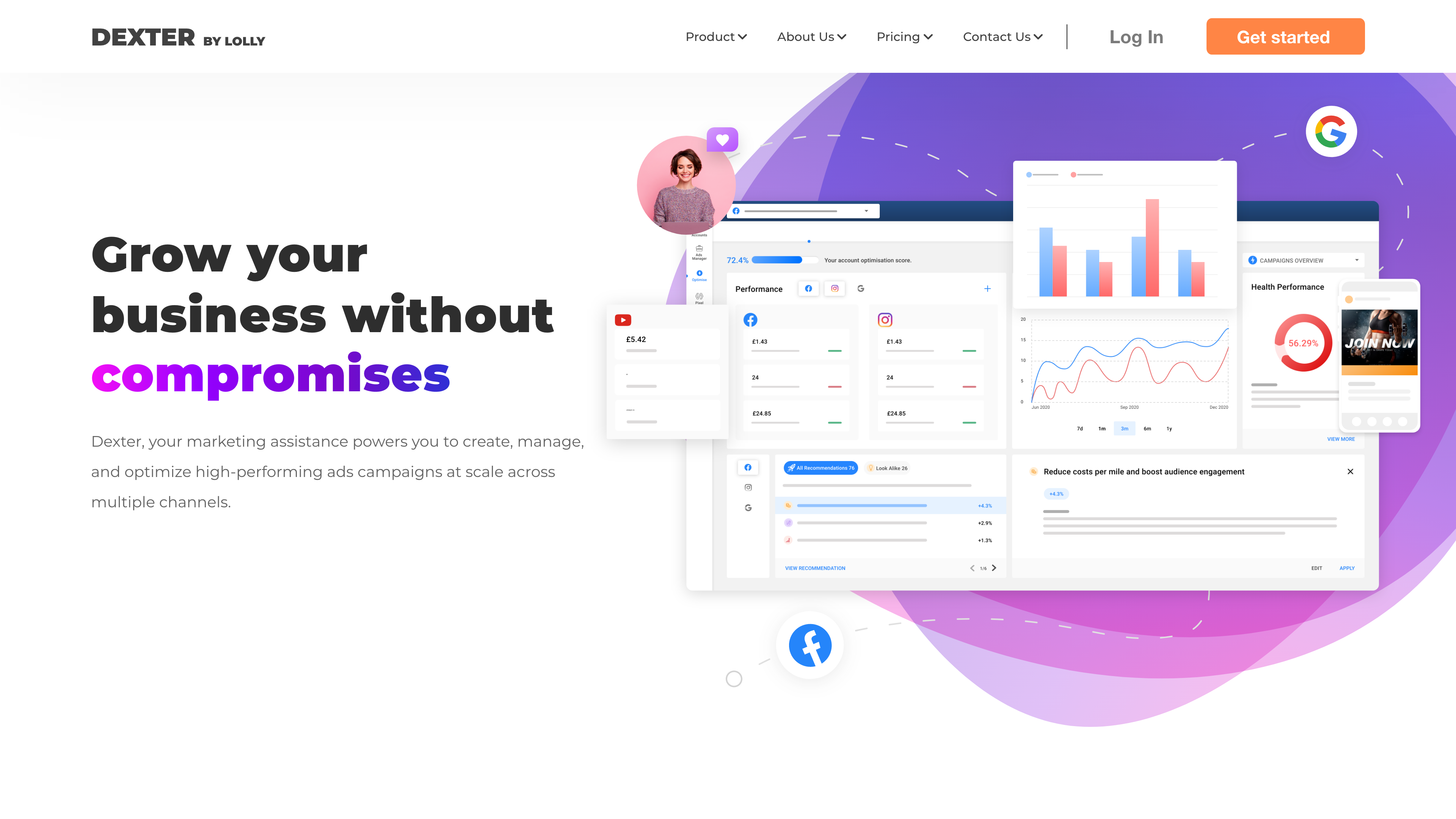
Dexter, your AI marketing assistant, empowers you to create, manage, and optimize high-performing ad campaigns at scale across multiple channels.

Sansa, your AI influencer marketing assistance that gives you the ability to find and build relationships with creators to expand your brand awareness and increase, all under one roof.
We turned the custom-made illustrations into animations to create a more robust engagement between the user and the brand. And also uses it as a way to communicate the benefit and value each feature can bring to the user.
To arrive at a fully established brand requires a lot of testing within the audience, from images, tone of voice, colors, and many others. Therefore, after the initial brand and website are launched. We will conduct a variation of AB testing to understand what our audiences are looking for. All these insights generated are to formulate a much stronger brand.
Different background variations and color choices would project another branding message to its audience.


Variation of copy and words can also be tested to gain insights on which one builds the best personality with which the audience engages well.


Variations of landing pages are to be tested to gain insights into which variations and forms can drive the most conversion to the platform. And from here, we can understand the kind of users we appeal to most.


Further testing to be conducted to collect more quantitative and qualitative metrics to understand the success of the re-brand. Post-launch metrics will also be analyzed to measure metrics that impact the business.
Does the new launch website increase the user sign-up rate because of the brand's unique position?
Does the user understand the newly built brand identity and attract the right audience?
Has the duration of the user staying rate within the website increased because users understand the values Lolly can bring to the user?
A direct user interview with a hand-picked audience according to the persona is built for Lolly to understand what they think of the newly formed brand?
Building a brand from the ground up requires a heavy load of understanding not only what the founder's vision would be for the company but also the ability to fully take on other stakeholders' thoughts on how they see the brand as equally important. Therefore, communication has played a huge role in this process particularly.
Testing plays a critical part at every design stage. The more testing we could do, the more refined and aligned the brand identity and position would be against the overall experience and business goal.
The ability to collaborate across cross-functional teams is essential. I collaborated with CEOS, operations, sales teams, and marketers to bring out the company vision from all perspectives.
One of the challenges throughout the rebranding process was correctly positioning the brand within a market sector saturated with many other technology companies. It was crucial to highlight the company’s unique aesthetic in a way that would engage users and elicit a positive reaction.
Building a new brand required close collaboration with the CEO to accurately understand and project his vision for the overall brand image. The core challenge was finding a balance between the business and product perspectives without compromising either. The key to success was maintaining honest and transparent communication at all times, allowing feedback to be taken seriously and critically.
Reflecting on the project's overall success, the toughest period was at the beginning of the design process. I had numerous one-on-one meetings with the founder to fully understand his vision and translate it into designs to build the brand. To be honest, I wish I had collaborated more with other stakeholders instead of focusing solely on the CEO. During design reviews with the internal team, feedback from other stakeholders made me realize that I had missed or overlooked several aspects, which caused delays in the project.
